P
BEYOU
An intuitive gender-neutral mobile app to learn a holistic approach to managing menstruation and its associated disorders


Tools
-
Figma
-
Usability Hub
-
Optimal Workshop
-
Canva
-
Zoom
Responsibilities
-
Competitor Analysis
-
User Research: Interviews & Surveys
-
User Personas
Roles
-
UX Research
-
UX Designer
-
UI Designer
-
User Flows
-
Wireframing: Paper & Digital
-
Prototyping
-
Usability testing
What is BEYOU?
Control
Notice patterns in your emotions, sex drive, mood, and take control of your menstrual health, and learn what’s normal for you
Discover
Holistic practices and articles curated by health experts about an array of menstrual health and its disorders
Beyou
No assumptions about gender and sexual orientation. Steering away from gendered design and being mindful of gender-inclusivity
An app to maintain menstrual health and lifestyle

Track
You get to decide how your data can be used or not by enabling data privacy. Identify trends in your cycle, and keep track of your overall health
What's the story?
Problem Context
During one of my menstrual cycles, I was struggling to get hold of myself from cramps and I had to stop taking painkillers due to the side effects these medicines are projecting on my body. That's when I started to search on the computer "How to ease my menstrual pain without pain killers?" and there I see multiple articles and videos about holistic practices that I can follow to ease my disorders, how tracking your menstrual cycle can help you maintain a routine and prepare for the days ahead.
I started taking notes of my symptoms, and moods and saved various links to videos and articles that I can follow to alleviate my pain. I found myself emotional about how much information is out there to help people like me who suffer from disorders but have no time or energy to search for these when needed.
This is when my inspiration to design an app to track my menstrual cycle, journal the symptoms, moods, and ability to find verified videos and articles about the menstrual cycle has begun and I started to materialize my ideas.
Objective
Say Hi to Beyou.
An app to track your menstrual cycle, follow verified holistic practices to ease the disorders that come with menstruation, journal your emotions, and symptoms to get control of your health, and maintain a healthy lifestyle.
What makes Beyou different?
Menstruation is not specific to females or any one gender. Beyou steps in with a gender-inclusive approach of neutral design steering away from stereotypical gender-biased colors and data.
Also,
In the current world with reproductive rights and selling data, Beyou has complete data privacy and a policy of not selling data to any third parties. Users will have the ability to encrypt the data to protect digital data confidentiality
Design Thinking Process
Empathize
-
Competitive Analysis
-
User Research
-
User Personas
-
User Flows
Ideate
-
Information Architecture
-
Sketching
-
Wireframes
Prototype
-
Interactive Prototyping
Iterate
-
Usability Testing
-
Preference Testing
-
A&B Testing
Competitive Analysis
What's out there already
Reminders and useful health information on periods, pregnancy, diet, and exercise.
Users can track period and pregnancy phases without premium membership.
S
O
Gender neutral design.
Simple and easy design so users won't get frustrated and confused using the app.
W
Complicated user interface to access various features in the app.
Very limited access to features, information, or articles with the free or basic subscription.
T
Wide range of articles, information, access to established doctors in the app with premium subscriptions.
I started the journey with market research to explore and understand how current menstrual tracking apps are designed, their functionality and how users are responding to the apps and their reviews.
Flo and Period Tracker are in the top 10 tracking apps that I chose to conduct competitor analysis on.
Both of these apps are overloaded with features, premium subscriptions, and free access to very limited data. These apps are targeted and very specific to females with the data they provide, designs, and patterns of the app.
To better understand what current users of these two apps were saying about the usability of the app, I went and read user reviews from Google Play and Apple Play stores. Most of the user's complaints were about access to data, stereotypical designs, very complicated features, and overloaded UI.
SWOT Analysis
User Research
What users really need
The next process in this phase was to talk to potential users who go through menstruation and also validate quantitative data through a survey which will be useful for the app. Understanding the user and their underlying frustrations and needs was crucial to help me start crafting features and designs.
I conducted 3 interviews virtually via Zoom with potential users ranging from age 17 to 40 and sent out a survey, gathering 9 responses. Here were my summarized findings.
.png)
Key Insights
Privacy
Menstruation is a very personal topic and when users are letting the app track their cycle, we need to keep in mind data privacy and how the data is being used and shared.
Representation
Menstruation is not specific to gender "female", ethnicity, or color, so making sure to represent various genders, and people from different ethnicity and color will make our app more approachable, and make feel people included and safe.eir cycle, we need to keep in mind data privacy and how the data is being used and shared.
Recommendation
Users need a way to follow and practice holistic approaches to include them in their daily routine to regulate or alleviate menstrual disorders or symptoms.
User Personas
Meet my Personas
To better visualize my research and empathize with the users I created 2 personas representing the target audience based on my user research. Having these personas I will be able to step into users' shoes which helps to keep users' needs goals and behaviors in mind along the design process.
“When you design, you have to understand what the capabilities are of the people you're designing for.”
— Don Norman, “Grand Old Man of User Experience”


User Flows
and their journeys
To understand the journey of my users I mapped out the process they would go through using Beyou to visualize and organize the foundation and features of the app. I crafted a sitemap which will be an overview of the app's layout with the features I needed to include and organize them in an intuitive and accessible layout. These flows and sitemap will serve as a blueprint to ideate designs in the next phase.
.png)
Practice yoga via videos in the app

Track and update your mood/symptoms

Add/update your period dates

Sitemap
Wireframing
From Sketches to Wireframes
It was time to start sketching out my design ideas for the app layout and general flow of the screens then transform them into low-fidelity wireframes on Figma.


Iteration Process

Discover page
Low Fidelity
Mid Fidelity


High Fidelity

Final High Fidelity
Usability Testing
P1
P2
P3
P4
P5
P6
Observations
Was looking for facebook link to sign in
Used search bar to search for articles
Clicked on recommendations category under "Discover"
Looked for Face ID to sign in
She was surprised to see the cycle length drawer pulling up
Hana looked confused between Discover and Education
Clicked on like button to save it
Won't use social media to sign for privacy prupose
Was about to click on "my Diary" to check cycle lengths
Uses only email to sign in for privacy reasons
Avoids social media sign in other than Apple ID
Was expecting to see cycle length in "My Diary"
Negative Quotes
I wont have time to look around
I wouldn't look for liked items in My Diary
Cycle length looks like a button more than header
Background color in "My Diary" is too light
Text can be a little bigger
I am lazy to input credentials
Education and Discover labels seems same
I should be able to click on "Average" "Months" to enter information and check information
Profile and Account are same thing
Education could be under Discover as both looks same
Account and Profile are very similar and account could be under My Diary
Heart icon to like/save looks confusing as Instagram uses save icon to save into collection
Education and Discover are confusing as both have same topics
Validate with real people
Now is the time to test my features and functionality with real people to identify points of friction, and expectations against the attitudes, behaviors, and psychologies of potential users.
I conducted a moderated usability testing with 6 people to test my designs remotely via zoom. To organize my usability test insights I created an affinity map.
Errors
Clicked on facebook icon to sign in
Clicked on forgot password
Clicked on "Average" thinking its a button
Clicked on Education to
see videos/
practices
Clicked on "my Diary" to check for previous cycle length
Clicked on "Education" to search for videos/
practcies
Clicked on Calendar to check previous cycle length
Clicked on "Education" to search for videos/practcies
Clicked on "Home" to check for saved items
Clicked on My DIary, Home, Education to see videos/
practcies
Clicked on "Edit cycle" which is not working
Clicked on Profile to check for saved articles/videos
Clicked on "Period Flow" under My Diary
Positive Quotes
Text could be longer and less spacing
I like the colors and it does feel inlcusive
I will like it to reference for future
I use search bar instead of comb through all categories
Edit Cycle in My Diary is helpful
Easy to navigate if user reads contents on screen
Cycle length shows the information needed
Recommednations based on my data would be helpful
You have got good flow to the app
I like the colors and could also reverse the palette
Recommednations or Top 10 videos specific to periods would be helpful
Mood Journal will be really helpful and comes handy to log in mental symptoms
Issue 1:
User confused with labels Education and Discover
Solution:
Merge both pages as they serve a similar purpose and avoid confusion.
Issue 2:
User can't find Diary or Journal
Solution:
Make Diary its own page for easy navigation and accessibility respective to the purpose and features residing in it.
Issue 3:
Foreground and background color contrast issues, user unable to read
Solution:
Update the color palette to include accent color and increase contrast for base colors.
Issue 4:
Readability issues with text, Image and Icon sizes
Solution:
Increase the sizes of imagery, and fonts throughout the app for better legibility.
Icons, texts and background contrast


Placeholders and prioritization


_edited.jpg)

Design
Primary Colors
#54457D
Signifies wisdom , spiritually
#54457D
Signifies balance, peace, healing
Linear Gradients
.png)
#A78CBF
#D5C7E2
Background Color
.png)
#85B18C
#638968
Accent Color
Secondary Colors
#333333
#10527B
#FEFEFE
Color Palette
Making it look beautiful
Keeping in mind the principles of Gestalt, color psychology, and color theory, I defined a mood board that served as a guide for my app design.
Color Palette
Colors are carefully picked to steer away from stereotypical gender-biased colors and strive
gender-neutral design, represent nature, and promote calmness and peace.
Font Selection
Lato is known for its round edges and the approachable warmth it gives to the reader, while the strong structure provides stability. Lato is used throughout the application.
.png)
Moodboard
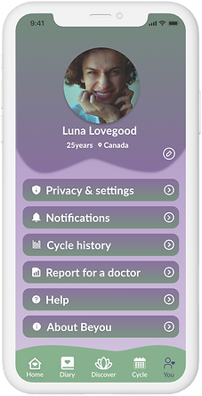
Final Design
Splash Screens


Finalized clickable prototype
Takeaways
What I learned
As the sole designer for this project, it was a rewarding and exciting learning experience to perform responsibilities framed within multiple roles in crafting research strategies, putting together information architecture, and designing the UI features.
User research and user testing play a crucial role in the whole process to ensure that my designs are useful and I am not designing for myself. To fulfill user needs, user data is extremely valuable, and there is no right or wrong way in designing, it is always important to put user needs and experience first not one's personal opinions. Testing your designs to see what works, what is important, and what matters to users is beneficial.
The process of iteration and refining my design has taught me to be patient and know that the design is constantly evolving with user needs and experience, forcing me to not get attached to my designs.
I am learning...